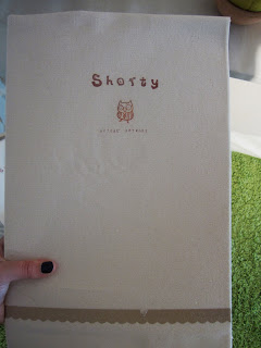
This post is very very very much overdue, but here it is! Some waffle about the Edinburgh College of Art Degree Show that I visited about a month ago now (at the start of my chicken pox attack!) I really enjoyed the show - there were so many different things to see, I wish I could have spent the whole day at the college (which is a very nice building by the by!)
We were greeted by students from the college who gave us a nicely designed map to help navigate our way round the building.
BA(Hons) in Illustration
Our first stop was the Illustration course's exhibition, and I was really impressed by it all!
Each student had their own area to personalise and feature their work on (similar to how my Foundation year exhibition) - which I thought was very effective, as every student gets an equal amount of space with their portfolio alongside it. I always feel a bit short changed when looking back at my own degree show, as my university didn't implement such a technique, and as all of my work was on screen I got very little wall space and two pieces of my work were featured on a screen in the room and then my portfolio was put along with everybody else's - which I think makes it hard for viewers to find a particular person's portfolio and such! ANYWAY, enough of my rambling about days gone by!
I particularly liked one student's take on personalising their own space!
I thought it looked lovely, the way Jade Price presented all her bits of work looked very sweet and quaint! (You can check out Jade's website here: www.jadedraws.com/)
All of the student's had a selection of work out on display, as well as professionally bound books/sketchbooks of any development or extra work.
The Illustration course also had a shop with a large selection of the students work available as prints, greetings cards, canvas bags etc - I thought it was a really good way of funding the university and also gives the students experience of producing their own wares!
(I would have loved to have bought the print of this piece of work but I succumbed to something else I stumbled to a tote bag featuring Gary McKean's amazing painting style - which you will see a little later on in this post!)
Masters
We then went across the hall to look at the MA in Illustration's display of work - and once again I was blown away by the quality of the work in the show. Pictures speak more so than my old jibba jabba, so here you go….
There were two illustrator's works I especially enjoyed! Kate McLelland being one of them! I was enchanted by her beautifully simple children's illustration as well as her typography work - these photos of the word 'Flourish' made me drool very much so!
If you would like to see more of this lady's work, you can find it here: katemclelland.co.uk/
And the other illustrator's work which made me chuckle was Gary MacKean's rough and ready painty style. I really responded to his sporadic splattery style - especially as it incorporates the more traditional medium of acrylic paints - which is something that you don't see as often in illustration work these days (I feel anyways).
If you would to see more of gary's work you can view it here: garymackean.com
AND I've just remembered two more people's works I really enjoyed as well! One goes by the name of Laura Manson, who crafted these lovely nautical themed pop up cards - which looked very polished and (me and my boyfriend both agreed) should have been on sale in a gift shop - for we would have happily bought them!
Laura's website is still under construction, but when its completed you can check out all of her awesome work here: www.lauramanson.com
And the next illustrator calls herself Shorty Lee. Shorty Lee created a magical little wonderland with her space! The theme of her exhibition space centred around a children's book she had made using a colourful, playful style entitled 'The Magic Sheep'.
If you would like to see more of Shorty Lee's work you can gander at it here: Shorty Lee's Website
And she also has a blog, which you can find here: Shorty Lee's Blog
And then heres a bunch of other beautiful work that caught my eye, but I was so snap happy that I didn't get a chance to catch the illustrator's names! (I'm really sorry to not be able to name these illustrators! My apologies!)
(Note: Some of these extra ones may be the works of people I've already mentioned, but my brainium is scrambled as its been such a long time since I visited the show that I didn't want to wrongly credit a piece of work to someone!)
I really really really really really liked the illustrators exhibition - I think they all made great use of the space they were given and used a variety of ways to showcase their abilities to the viewer. And the amount of items available in the shop was tremendous! I personally wish my degree show could have been along similar lines - and I could have been responsible for my own space rather than having our work and portfolios dotted separately from each other; making it difficult for someone to locate the right person's work.
Righto. I think that is certainly enough photo action for one blog sitting! I'm going to make this a two parter blog post. In my next post I'll show you some of the piccy wics I got of the Graphic Design and Animation exhibitions!
Phew, I don't know about you but I need a jolly good sit down after all that waffle!


No comments:
Post a Comment