Aaaaannnd we're back with the Edinburgh College of Art Degree Show!
After salivating over the various illustrations, we headed on over to the other side of the building to check out Graphics and Animation.
I've got to say the building was really cool! Large, spacious and but still using the traditional building structure.
(I generally feel a bit sad when thinking about Liverpool Academy of Art & Design (aka. John Moores University) building, as we moved into a brand spanking new building in my final year. It is very modern, spacious and impressive; but personally I missed the nice old-fashioned aspects of our previous building on Hope Street - it felt like there was more history in it! I'm sure as the LCAD gets more use it will achieve a similar sort of feel to it as well though! Plus I'm just like an old-fashioned stuff cause I'm set in my ways!)
Graphics
The Graphics exhibition was within an semi-enclosed area with bits and pieces from the Fashion course surrounding it. I felt there wasn't as much work in the Graphics exhibition - as in there didn't seem to be many students doing it; but I suppose when you have Illustration and Animation as separate courses, the students spread out a bit more (in comparison my course covered all of these different subject areas, hence a lot more students!).
I noticed there was lots of infographics going on in the exhibition, which I like! (It does appear to be quite trendy at the moment, don't it? One that I particularly liked, due to its delicacy and complexity was by Sofia Noble.
To check out more of Sofia's work you can go to her website here: Sofia Noble's Website
I think Markos Zouridakis' work was next to the Ms Noble's - and I quite enjoyed his work too (even if I felt too stupid to fully understand it all!)
I liked his traditional style with his use of slight decorative elements; as well as the limited colour palette. Markos' diagrams reminded me slightly of the blueprints you would see in some Tom & Jerry cartoons!
You can view Markos' portfolio here: Markos Zouridakis' Portfolio
I enjoyed Alice Lafford's identity design for a place called 'Mono' - a bar/cafe/vegan restaurant/vinyl store/gallery/music venue/mini brewery nestled in the city of Glasgow.
And this piece by Katelynne Kirk made me chuckle (I know a lot of people in my work who would like this!)
Katelynne's website can be found here: Katelynne's Website
I really liked this modern approach to an identity/packaging design for Long Stem Whiskey by Verity Davis. Verity's Website
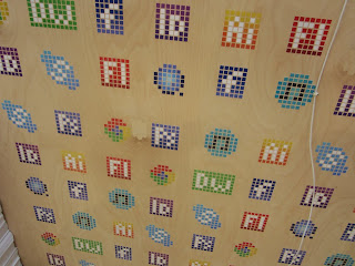
And Anne Helene Vestrum's pixellated computer software logos looked awesome!
Animation
We then moseyed on upstairs to behold the Animation exhibition, were we saw a wide array of different stories and styles.
Each animator had their own computer all set up with their work playing. The first animation I watched was called 'All That Glisters' by Claire Lamond.
I found the rough style of the stop-motion animation really added to the story and subject matter - I loved the bright colours of the glitter standing out against the generally neutral palette. A very touching story, which really spoke out to me due to my own experiences.
You can find Claire Lamond's website here: Claire Lamond's Website
A piece of beautiful animation I watched was by Vitali Sichinava, it was a really unique style that I've rarely seen done before! Unfortunately I can't find a trace of this animation on the internet bar one image, and Mr Vitali doesn't appear to have a website!
The animation is called 'Tea Party', Vitali describes his animation as a "story about tea, love, life and death. It is mainly influenced by the work of great artists like Yuri Norstein, Francheska Yarbusova, Valeriy Ugarov, Fedor Chitruk and R.Ingpen"
An amazingly polished and professional-looking piece of animation was 'I am Tom Moody' by Ainslie Henderson. (There isn't a full version of the film available on the internet as of yet, but I have found this awesome Making Of video which allows you a deeper insight into the short film, and how accomplished it really is!)
You can see more of the works in progress of Ainslie's animation at his tumblr: Ainslie's tumblr
(Watching that Making Of video really makes me miss animation man…waaah I wish I got to do an animation in work!)
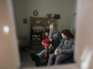
As well as the computers, the students had a small room in which all of their work was shown on a large screen with seating, and another space featuring portfolios, storyboards, models etc! I looked through a little peephole to see a scene from Claire Lamond's work!
I would say it would have been nice for the animation students to have a larger space to display all the little snippets of their development work as well as their final product! (But I know very well when you're poring over an animation that how your work is going to be displayed is the last thing on your mind!)
And finally here is a couple of pics of the College of Art's newspaper detailing all of the work featured in the show.
So there we go! Thats all I saw at the Edinburgh's degree show!
It was pretty darn awesome. I loved it. I will definitely be tootling up to Edinburgh again next year to check out the show - and ALL of the show this time! I've only shoved photos in your face of three subject areas, there were so many others to explore I think I could have spent days in there - and I think I will be next time!
You can check out ALL of the students featured in the degree show at their very own website: ECA 2012 Degree Show


No comments:
Post a Comment